TECHNIQUE A PALETTE – visual writing method started in the newspaper Communication and Forms in September 2004
The technique of palette –
visual writing method started in the newspaper "Communication & Form” in September 2004
July 2006 pima pubblicazione sul giornale Communication and Forms al sito formedicomunicazione.com
The technique of palette – Metodo di scrittura visiva iniziato sul giornale "Comnicazione & Form" in September 2004; Authors: Angela Battle, Gianfranco Russino, Walter De Maria, Maria Richichi, Andreas Pilloni
Giù il formato pdf
_____________________________________________________________________________________________________________________
Authors: Angela Battle, Gianfranco Russino, Walter De Maria, Maria Richichi, Andreas Pilloni.
The parole colored: aesthetics’ and meanings:
Colorful words are essential to visual writing technique undertaken in September 2004 by the newspaper "Communication & Form", experimentally with a single color in most of the usual blacks.
afterwards, in February 2005, in the article "The unique name” http://www.formedicomunicazione.com/il_cognome_esclusivo.htm
colors more became 2: He was added to the blue green.
In addition aesthetic and visual appearance was born the need for "distinction"; distinguish, cioè, one person from another, highlighting it with colorful words.
Colorful words took the characterization of "a palette technique” (greater number of colors) especially in the internal communication between management and Web master in the setting phase of the articles and the subsequent forwarding to email.
In this internal communication phase proved even more useful to acquire a writing language that, going to add to the literal meaning, not velocizzasse:
1) the transmission
2) decoding
3) the comprehension
4) the application
in internal transmission process between transmitter and receiver.
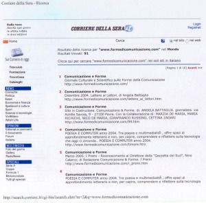
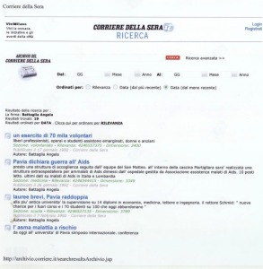
The use of colorful expressions in blue and green is very beautiful and is visible in the "Results pages” of Search Engines. Other important sources of information, then over time, They adeguono and follow their application [comparison, page depth: press 9 May 2005; press 28 July 2006].
Returning to the sections of the newspaper "Communication & Form", in the article of March 2005, "BEHIND THE SCENES – Colored mistakes ", http://www.formedicomunicazione.com/dietro_le_quinte.htm
we find other colors in the palette: blu, red, violet.
The red color, qui, visually indicating an error to be corrected, while the purple transmitted light and cordial relations.
COLORS went to form the operational and interpersonal content units.
The use of a same color categorizzava, classified, homogenized.
The area was limited to setting an article. Some rules remained unchanged and were then applied to the setting of other "united". The blue was used, always more often,
starting in February 2005 Gianfranco in the Address Book Russino "Visual Communication – Special edition": Joaquin Navarro-Valls
http://www.formedicomunicazione.com/comunicazione_visiva_edizione_speciale_febbraio_2005.htm
for titles and captions.
White, blue and yellow http://www.formedicomunicazione.com/il_racconto_del_mese_mar2005.htm
color, respectively, the three words of the title "Biancolina, Bluish and the Rainbow ".
In rainbow caption, qui, each letter has a different color.
Using color burgundy, violet, blu, but structural homogeneity in the use of colors, if you have, in the same month of March, 2005,
http://www.formedicomunicazione.com/la_tesi_di_laurea.htm
in "Communication as a Discipline".
Text all blue
http://www.formedicomunicazione.com/il_racconto_del_mese_di_ott2005.htm
It is in the story "The color of Scala”
In the article "The Copy and Paste", June 2005
http://www.formedicomunicazione.com/il_copia_e_incolla.htm
they were used, esthetically, green and red. Two colors "at the traffic lights", interpretatively very useful for other internal functions including drafts in collaboration with co-authors.
In "Poetry and Computers”
http://www.formedicomunicazione.com/poesiaso.htm
were distinct, with the colors, translations of the poems. In fact, in every language (English, French, German, Spanish, Portuguese) It was combined and applied in the title, its own specific color.
The pink hue, in "The heart wins", story of the month of May 2006,
http://www.formedicomunicazione.com/il_racconto_del_mese_di_mag_2006.htm
It resumed the dominant color dell'immmagine that accompanied the text by making visually pleasing and uniform the published page.
The color of the traffic light method saw later in time its methodological explanation- “ For added uses the color green, to remove uses the red color…” – precisely in the article "The traffic light, color method” in June 2006:
http://www.formedicomunicazione.com/il_semaforo.htm
Other applications of green, visually pleasing, They have been used for titles and captions (homogeneity in the same news report) http://www.formedicomunicazione.com/comunicazione_visiva_per_immagini_lug_2006.htm
in "Visual Communication Imaging” of July 2006
Even the orange color, extrapolated from the "palette” or range of colors, located inside of the newspaper entitled its exposure.
We must also consider that, observation, the "Report, thesis, essays” It seems "like” within its "foreign pages” colored interventions, so it remains consolidated the traditional homogeneity of black characters.
ANALYSIS progressive, as far as was possible in order of date, involved the following sections of the newspaper "Communication & Form":
– Articles and Special Services
– The Story of the Month
– Poetry and Computers
– Visual Communication Imaging
– The Communication as a Discipline
– Relations, thesis, essays
PERIOD considered: Years 2004, 2005, 2006
Goals achieved:
• visual pleasantness of published pages
• enrichment of meanings to the scripting language
• a working method "speeding and” between co-authors.
secondary objective: the satisfaction of the professional consensus in having found, lately, that other information sources are entering "the colorful words” in current publications.
CONCLUSIONS
The use of colorful words, in our experience, It gives visual aesthetics to the published page and, when the application is methodological, transmitted between co-authors and collaborators the same meanings.
below: press 9 May 2005 and Print 28 July 2006
press 28 July 2006.
Settembre 2016 Inserimento lavoro scientifico in formato pdf,
a cura della Redazione

